

Dealing with "mixed light"
Ok, so I'm going to do my best not to get excessively nerdy here, but I thought that this was a topic worth mentioning, so bear with me. Many times we walk into a situation like the photo below (completely unedited raw file)
Mixed Light
Nice entry way, but it is plagued by a photographer's worst nightmare... MIXED LIGHT. Let's put our science hats on and talk about why this is problematic. Some super smart person figured out that different light sources put off different color temperatures. For example, the "soft white" incandescent in the family room gives off a distinctly warm yellow glow, which measures at roughly 2700 Kelvin:
Incadescent Light
The daylight coming in from the windows/ front door measures at about 5000 Kelvin.
Daylight
The fluorescent bulb in the bathroom measures at 4300 Kelvin and has a distinctly green tint.
Fluorescent light
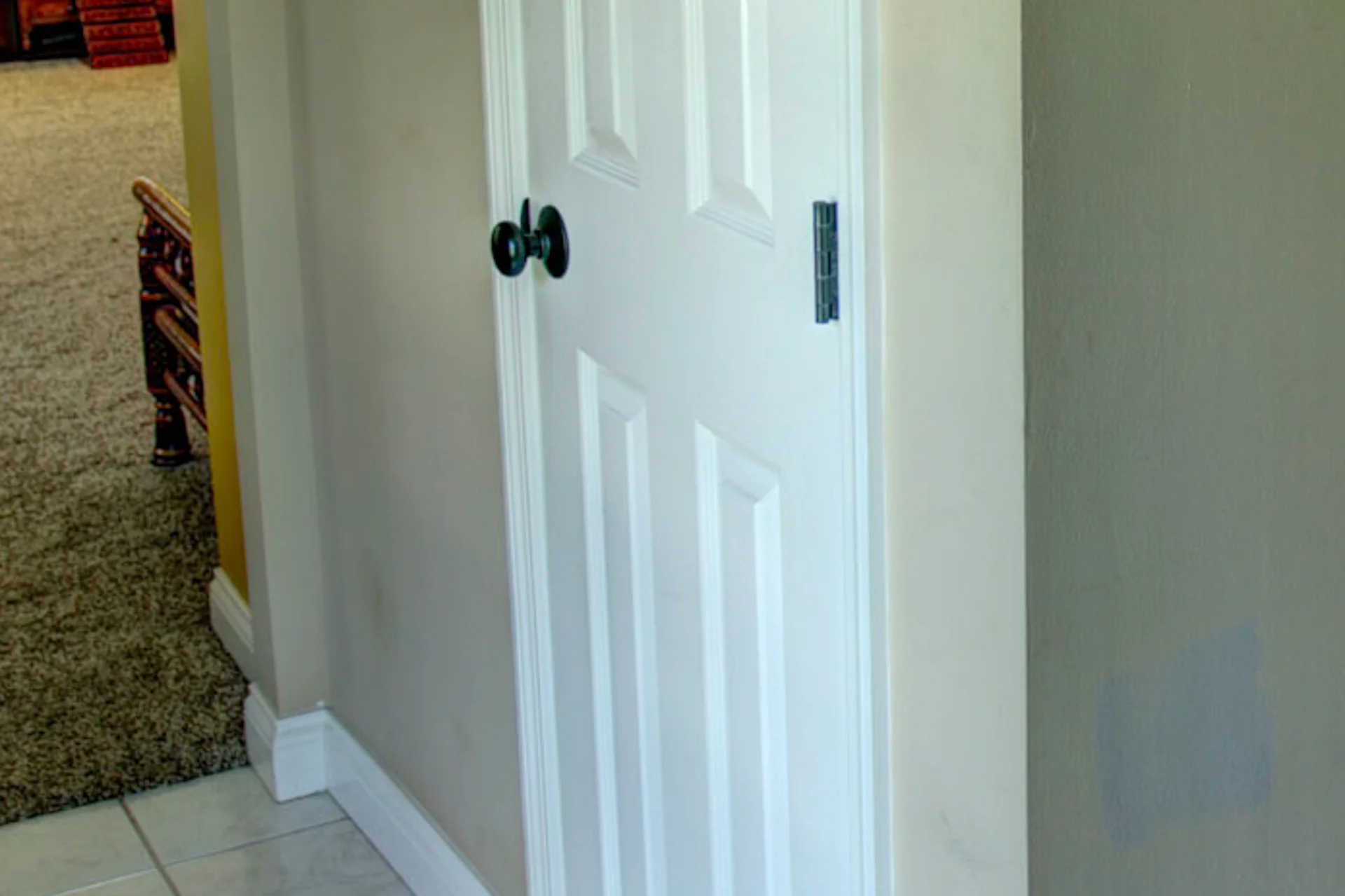
And finally, the halogen in the hallway measures roughly 3200 Kelvin.

Halogen Light
Looks a little yucky in pictures right? Notice the green looking walls (paint color is actually taupe), the blue, green, and yellow trim... So what do we do about it? In real life, we don't expect homeowners to be researching the color temperature of the bulbs they're buying, and there isn't a way to compensate for it "in-camera", so it is up to us in post production, to fix it. Conveniently, most folks have white trim in their homes which act as a benchmark for accurate color. If white looks white, we have done a good job. Unfortunately, getting there isn't as easy as it looks.
Below is an example if we were to color correct the whole picture for Incandescent lighting.

Whole shot adjusted for incandescent light

Notice how the living room looks great. White trim looks white. However everything else in the image looks kinda poopy. The taupe walls look like a mix of blue and green. This doesn't give potential buyers the right impression of the space. So next, we could try sucking all of the blue and green out of the image, theoretically leaving the pretty living room looking good, and the blue and green walls returning to a normal color. Check out the next image below:

Incandescent color balance with blue and green removed from image.
The blue and green are gone, but now the walls look grey and lifeless. You will notice that the kitchen in the top right hand corner of the image must have had soft white incandescent bulbs as well because the white cabinets look white.
Next, let's try doing it the right (yet hard) way. Using a series of brush techniques we will attempt to balance the color throughout the 4 different areas. Here is what the finished product looks like:
Room adjusted with color temperature brushes.

Original Image
As you can see, it's by no means a perfect image, but it does give potential buyers a more accurate view of what the space looks like. The doors and trim look white, the walls look taupe.
Talk to you all soon :)